Cannondale Jackknife

cannondale-jackknife

What do you make of this concept urban bicycle? It is more than just a simple restyling though. It’s a fold-able bike, and it’s axis of folding is pretty unusual – the seat tube itself rotates 180 degrees so that the front wheel flips to the back. What is more unique, however is the absence of any chains (or even chain equivalents like drive shafts). Instead, it is  hydraulic powered – no chain = no grease, no hanging bits as you fold bikes, fewer parts and less maintenance… though I do wonder whether the feeling of riding a bike would be markedly different. I’d have to get on one of these before I know.

After a quick scan of Amazon and the Cannondale website it appears this bike has not yet made it past the prototype stage, unfortunately.


Age 10 to 60 – through Make-up & Photography

Vogue Paris had a very interesting editorial featuring a series of photographs of the 20-years-old model Eniko Mihalik portrayed in the age of 10, 20, … 50, 60 respectively. It’s quite amazing how the overall look can be so malleable, achieved (perhaps not so) simply with tricks of the trade like hairdo, facial expression, make-up, photography angles, etc.

vogue-paris-10

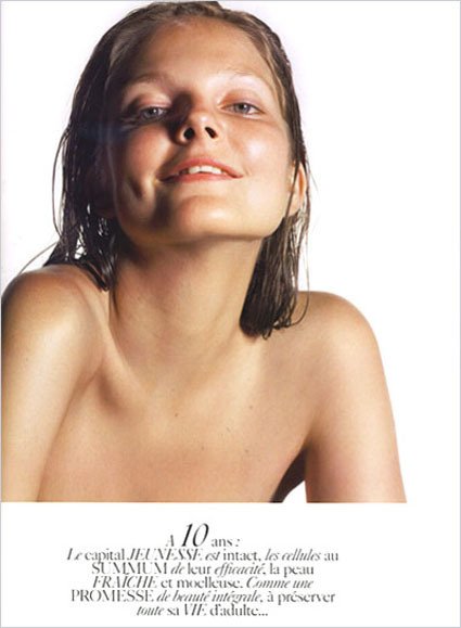
At 10, a certain wide-eyed innocence with a strong suggestion on bare-chestedness, half-exposed teeth (make them seem smaller and less full-grown), very light make-up, looking almost fresh out of a swimming pool or something.

vogue-paris-20

At 20, a rather typical high-school/college girl first getting acquainted with mascara and lip-gloss; expressions of youth with straight hair, painted finger nails and fun accessories (ring); there is a sense of eagerness and anticipation in the expression.

vogue-paris-30

At 30, she looks like she’s been through some really bad relationships, on the roads, and maybe have her life mortgated to drugs and alcohol, doused generally with a sense of cynicism towards the world.

vogue-paris-40

At 40, life reins in as she matures and develops into a more assured woman; the wild sides has not been eliminated totally but tamed to a more nuanced portrayal;

vogue-paris-50

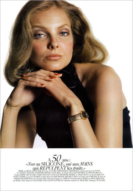
At 50, back to a very classic and enduring look showing a sense of refined sophistication after living through the many decades; tastes have been distilled and generally looks more classy.

vogue-paris-60

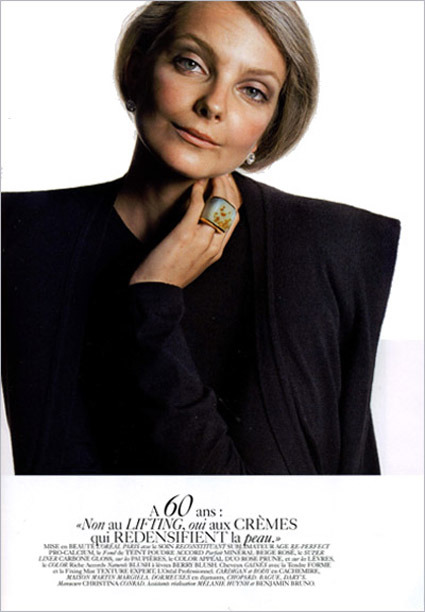
Finally at 60, the beauty grows inwards as the outer appearance are toned down in favor of more subtle expression (cropped hairdo, plain top), with a sense that the inner wisdom is now far more distinguishing than the outer appearance.

It’s really quite amazing that all these were achieved simply by modifying the external “packaging” on a person – that probably goes to show how precise the media can turn and distort “reality” by modifying how it is presented. Great works.

[via Miss at la Playa]

Pantone Color Cue 2

art_colorcue2_more

Looking like a cross between a Darth Vader (I’m serious, the first thing I saw was the face shape – maybe a frowning, angry Egyptian mummy) and a generic poorly-designed MP3 player, this device helps you identify swatches in real life by scanning it and matching it to a Pantone color.

It reminds me of a previous post where people tagged Pantone color charts to real-life objects. I used to think that these gadgets are the marks of a designer – I’d imagine someone who’d get “inspired” by the surroundings – perhaps the autumn leaves triggered a new fashion scheme or something.

But now I’m totally not sure about it. For one, “inspiration” would be pretty weak if all you can derive from it is a bunch of RGB or CMYK numbers. And also, why’d you need to match a color of a real life object – unless of course you’re simply just trying to copy it wholesale?

For those of you who do happen to use on of these, it’d be great to shed light on the how’s and why’s!

Cubrick: Stackable Storage

dragtrolleys

Cubrick is a stackable storage system that doubles up as a trolley when you need to move them around. This, to a person who’s been packing and moving around hostel rooms every once a year or so, is heaven-sent. Combining two different objects in one stroke, where both the design language and the usage-compatibility are apt and spot on.

Some (especially electronic firms) seem to think that having more features is a good thing. Well, some times it is, but much more often we see a mismatch of interface, function ala “USB-alarm-clock-radio-mp3-40functions-all-in-one”, unexplainable and confusing array of buttons not withstanding.

We must always maintain the clarity and focus especially when combining features with variable requirement into one product. One way I use is to cover up the other feature and see if the design is still pleasing/logical. For the example above, the product still look good if e.g. it is not a trolley and functions only as a storage box, and vice versa.

Flickr: Pantone colours in real life

Many designers swear by Pantone color charts, saying that they give the most accurate specification on what exactly he/she wants. I still have a half-suspicious view towards Pantone charts though – secretly thinking “are we just trying to make ourselves feel more professional?”.

Anyway, that aside, this Flickr photo-set made me smile, looking at the innocuous Pantone color placed against real life items. Is that trying to say that Pantone does cover every imaginable color? Or that most, if not all, of manufactured products were specified as one of those Pantone numbers?

pantonematchingcolor

Treadmill Dance


Treadmills, to me, equate monotonous boredom.  And so I was delighted to see an excellent piece of dance choreography that leverages the treadmills for a number of dance moves, making exercise on treadmills seem like a fun activity – no less thanks to a great matching tune, “Here it goes again” by OK Go.