Loanshark Marketing

Recently I’ve taken a special interest in a rather niche segment of marketing – those done by loan sharks. Johor Bahru (or JB – city in Malaysia) has a very high density of these (theoretically?) illegal money-lending businesses, catering to anybody from gamblers seeking a quick rescue to ‘proper’ businessmen needing just that bit more cash flow.

Growing up, I had the common impression of loansharks where they are generally  underground – where you need some sort of mafia-connection to get access to it. In JB this is a lot more ‘above-the-line’, where you’d see signs and phone numbers pasted all over, on practically every surface you can find.

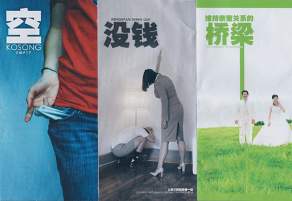
Recently though, I get impressed yet again with their level of  ’marketing professionalism’ – just received this set of brochures (only showing the front/back):
Loan Shark AD

Loan Shark AD

Check out the amount of design and creative direction (everything from layout, typography, photography to copy-writing, consistency in theme between the 3 separate brochures) that went into promoting their services: simply impressive!

Fight for Kisses


I think… with the developments of Youtube, viral marketing and such, marketers have upped their antes in an attempt to out-weird one another – the ad above for a shaver is probably just yet another example of the absurdity (and yet hilarity and memorability) in the years to come.

Sony PS3 “The Play Face”

sony-playface

When we’re immersed in an intense activity – gaming and watching a sports match perhaps – our mind enters z certain ‘zone’. Being fully concentrated on the game, we lose our self-awareness and personal restraint, unleashing the truest facial expressions.

That is exactly what PS3 wants to capture in their campaign “Play Face“:

It’s that face you make when you are playing video games and concentrating so much that you don’t even realize the kind of expressions you are making. And everyone has a different one.

Here’s a video:

There are also (very) similar prior projects though – such as “Immersion” by Robbie Cooper and “Video Gamers” by Philip Toledano. Concept originality aside, I thought highlighting the ‘play face’ was an engaging move by PS3 – we all know it, we are instinctively and visually connected with that ‘face moments’ if we’ve ever played any games ourselves, and it communicates the riveting nature of videogames perfectly.

Schwepperverscence Ad


Sony Bravia may be one of the early pioneers of ads in this style – but this ad from Schweppes is no less in artistic merit either. Using high-speed cameras at 10,000 frames per second, the ad lines up a series of moments just as water balloons burst, releasing the splashes of water inside in a cool, sensual and captivating manner (when seen in slow-motion and paired with apt music).

Hopefully more ads in the future move towards this!

Clever Nikon Ad

nikon

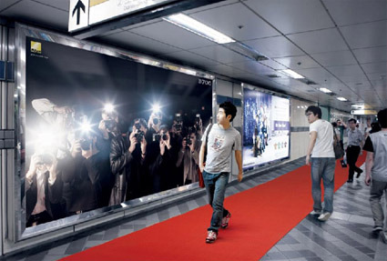
This is  a brilliant billboard advertisement execution for Nikon’s D700 camera in Seoul.

Along a busy subway station, there’s a backlit billboard featuring images of paparazzi (presumably holding the D700). As passers-by walk past, flashes are triggered, giving the illusion that the paparazzi in the billboard are jostling to snap a picture of the passers-by. The red carpet on the floor completes the scene, while also leading them to the store where the camera can be bought.

This ad is genius on a few levels:

  1. Attracts specific attention of the passer-by – there’s simply no way you can not look at the source of flashes.
  2. Appropriate – the context of the paparazzi photographers with Nikon cameras is a perfect pairing as well. Not only is the context for grabbing your attention with the flashes appropriate, the fact that paparazzi are probably one of the most discerning users of the camera (implicit endorsement) is also at work.
  3. The red carpet also serving dual-function: setting up the scene to make the passer-by feel like a celebrity, while also simultaneously doing the very important role of attention-conversion (into possible purchase) by leading to the shop.

Genius!

[via The Cool Hunter]

Nothing to Hide (Air New Zealand)


At first it looks just like any normal in-flight safety briefing video, perhaps just a little cheerier and more upbeat than usual. If you look closer, however, you’d realize that all the crews doing the briefing are… naked!

Fear not of indecent bits though – while they’re naked, they’re body painted with their usual uniform to still look very much un-naked; and of course, all their camera takes are cleverly angled and timed to avoid any sensitive exposure.

And why go through all these? The airline behind it – Air New Zealand – is promoting their tagline of having “Nothing to hide” (no hidden charges for checked baggage, refreshments, etc.). I suppose this somewhat gimmicky video just about captures this spirit and eyeballs!

(PS: the guy loading the baggage in the video is actually the CEO Rob Fyfe – I don’t suppose many CEOs have this sense of fun and involvement with their company!)

“Let it Shine” by Honda


Honda’s been building a reputation of making ads requiring intense, meticulous coordination and touching hearts one way or another – I’ve covered quite a few of them in this blog. Their latest ‘Let It Shine’ brings together a whole lot of (obviously Honda) cars on a field, using their headlights as little pixels that animate to the tune of a ‘Let it Shine’.

Not exactly breathtaking, but fresh nonetheless! By Wieden + Kennedy.

Samsung’s Screen for little Furries


Cuddly animals doing their cute little expressions never fail – and that’s where Samsung’s advertisement angle comes from I suppose. To promote their Ultra Touch handphone (which boasts large colorful screen), they began to imagine how phones may be creatively leveraged if they were in the hands of our intelligent, furry friends – hamsters, guinea pigs, hedgehogs, etc.

Creativity + Cute: LOLcats tweaked for mainstream promotion.