RCA + Imperial to form Strategic Partnership

rca-imperial

From the News Release:

The Royal College of Art (RCA) and Imperial College London announce today a major strategic partnership with the creation of a world-class £5.8 million multidisciplinary centre called Design-London at RCA-Imperial.

Its purpose will be to bring together the disciplines of design, engineering, technology and business to address the challenges of future innovation. This initiative is being developed as part of the core strategic aims of both institutions and in response to the recommendations for Higher Education described in the Cox Review of Creativity in Business (November 2005), carried out by Sir George Cox, Chairman of the Design Council, and commissioned by Chancellor Gordon Brown.

Design-London at RCA-Imperial will create an ‘innovation triangle’ between design (represented by the Royal College of Art), engineering and technology (represented by Imperial College Faculty of Engineering) and the business of innovation (represented by Imperial’s Tanaka Business School).

Ah yes! The magical synergy between design, engineers and business (it’s about time we discard these compartmentalizing labels, isn’t it?) – it’d be interesting to see the results from this!

Book Pop-Up Photography

paper-cut-up

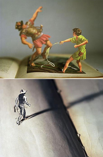
Allen’s photographs are inspired by his childhood experiences with pop-up books and View-Masters. He begins his process by cutting figures and images out of illustrated pages of old books and vintage fiction novels. Allen then cleverly rearranges and juxtaposes the forms to create three-dimensional scenes. Next, he carefully lights his subjects and photographs the scenes.

Extremely poetic, don’t you think?

[link]

PowerCursor

powercursors

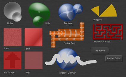
PowerCursor is a Flash toolkit that web designers can embed in their designs to have interfaces with tactile properties – like slope, roughness, motion, etc. – by simulating them in terms of visual feedback. For instance, if you hover your cursor over the “Hills” area, your mouse cursor moves much slower when going “upslope”; if you run your cursor in the “Maze”, it can only follow the paths, etc. This brings yet another dimension into websites that are traditionally thought of as flat papers – “webpages“.

The application could be interesting – giving textures to a website. For now I can’t quite imagine a site which would be enhanced by this – maybe Flash games. I just hope that Flash web interface designers would take a page from history: let’s not have a whole barrage of “texture-enabled” websites that serves little to enhance, or even deteriorate, the usage experience, ala “Skip Flash Intro”.


World of Visacraft

wow-visa-card

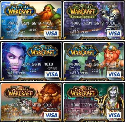
While you’re unlikely to swipe the card for a Blade of Hanna in real life, these World of Warcraft Visa cards are as real, physical and plastic as they get. There are a total of 13 designs to choose from – each with a character type from the online game – so you could display your hardcore gaming creds whether online or off:

“So ‘Sup, what do you want?”
“Hi, I’d like to get one of these, charge it to my WOW Visa.”
“Thy will be done, o Level 70 Draenei Paladin. I am honored by the kind blessing and patronage you have brought to our humble town.”

Anyway.

With a credit card that is so heavily branded by a single entity (an online game, even), one would thus expect some tremendous incentive specifically for WOW players, especially with the slogan “The card that pays you to play”. On the contrary, the rewards for usage is really crappy though. Aside from the 1-month free WOW subscription upon card activation (which is at least decent), you only earn game time at 1% of every dollar charged – which means, you need to spend $1500 to get a month of free gaming. In another perspective, you can buy 100 months of game time to get 1 month’s free.

WOW! indeed.

Jesh de Rox Photography

jeux-photography

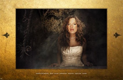
I stumbled upon this website, which starts by asking which of these do you feel today: nostalgic, like dancing, blessed, like stargazing, surreal. 2 more of these somewhat irreverent questions later, it finally reveals itself as an experiential outreach site for a wedding photographer.

It’s hard to describe it in words – but I think this was a great site and experience. Most professional wedding photographer’s sites would probably showcase their own work, how good they are, the variety/depth of their commissions, etc. It’s like a slick business presentation, hoping to impress the visitors enough to engage them. In other words, those sites are about them, the photographer(s).

This one takes a totally different tack – by being human and caring about the visitor. I felt like I was the center of this site’s universe (whatever that meant). Accompanied with a splendid choice of music (great music, but not mainstream or cliche at all), it feels really personal and special. The questions at the start worked to set a mood by laying down the visitors’ guards, while inviting a reflection of themselves. The Flash usage is for once aiding the site design, IMHO: seamless, straightforward, where one doesn’t look for the “Skip Intro” button. The photographs themselves are of course also great – some of them are almost like classical paintings.

After all, weddings is an intimate, special and happy occasion for the couple, perhaps also a time of reflection and to count the blessings, rather than simply an event that you tick off and execute like your typical business convention. I think this site caught that spirit.


Spirals in Nature

spirals

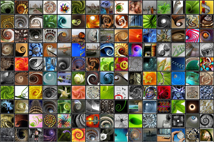
I used to recall my personal discovery of the mathematical rhythm in nature, and was totally fascinated by how nature embeds specific proportions in its beings. It seemed to be then that if I can master Pi and Phi, I’d probably rule the world, create master pieces in design, and stuff like that.

Well, spirals would be one of the many examples of mathematical proportions at work in nature – and this site has just about every spiral you can imagine! While I’m not exactly sure how that would be of use, it’s still a pretty (literally) good time-gnawer just browsing through the many pictures!

Mini Wonderland Hamburg

hamburg-miniature-museum

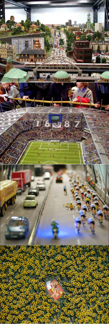
If you’re a modeling (that is, the art of coloring and assembling scale models, as opposed to the art of posing and walking) fanatic, you’d probably be in permanent orgasm when you’re in Hamburg’s Mini Wonderland. Housing the world’s biggest  model railway tracks, it is a stunning showcase of the most detailed scenes from the world. Cars, bridges, human figures, the level of detail is truly amazing. HOW on earth do they place all those people in the stadium? And it’s not just straight lining-up of models – they do make it more interesting by adding little twists and life, like the cyclists who’d fallen down, and even, the couple making out in the sunflower field. Amazing!

More pictures here.