World of Visacraft

wow-visa-card

While you’re unlikely to swipe the card for a Blade of Hanna in real life, these World of Warcraft Visa cards are as real, physical and plastic as they get. There are a total of 13 designs to choose from – each with a character type from the online game – so you could display your hardcore gaming creds whether online or off:

“So ‘Sup, what do you want?”
“Hi, I’d like to get one of these, charge it to my WOW Visa.”
“Thy will be done, o Level 70 Draenei Paladin. I am honored by the kind blessing and patronage you have brought to our humble town.”

Anyway.

With a credit card that is so heavily branded by a single entity (an online game, even), one would thus expect some tremendous incentive specifically for WOW players, especially with the slogan “The card that pays you to play”. On the contrary, the rewards for usage is really crappy though. Aside from the 1-month free WOW subscription upon card activation (which is at least decent), you only earn game time at 1% of every dollar charged – which means, you need to spend $1500 to get a month of free gaming. In another perspective, you can buy 100 months of game time to get 1 month’s free.

WOW! indeed.

Airbus Evacuation


Here’s a video of the test-evacuation done on the Airbus 380, currently the largest airliner in the world. At about 50% bigger than the rival Boeing 747, the aircraft can house up to 853 passengers in the full economy class configuration spread over the plane’s two decks. And since it’s a whole lot bigger, they needed to test the evacuation as per safety regulations. Some of the conditions to meet are:

– Only half of the 16 exits would be opened. The other half are considered “blocked”, and cannot be used. Neither the crew nor the passengers know beforehand which exits are blocked.
– Out of the participants, 35% must be over 50. A minimum of 40% must be female, and 15% are female and over 50.
– Happens in darkness. Only the emergency lights are on.

So 873 (including crew) people have to be evacuated in they need to get out in no more than 90 seconds, including the time required to deploy the inflatable slides. They did it in 77 seconds. From the video, the participants seemed to be rather calm, and knew what to expect/do. Maybe they’ve got the staff and families to participate, or maybe there are rehearsals (?). Maybe all those over 50 are aged 51, and are Boston marathon participants.


Jesh de Rox Photography

jeux-photography

I stumbled upon this website, which starts by asking which of these do you feel today: nostalgic, like dancing, blessed, like stargazing, surreal. 2 more of these somewhat irreverent questions later, it finally reveals itself as an experiential outreach site for a wedding photographer.

It’s hard to describe it in words – but I think this was a great site and experience. Most professional wedding photographer’s sites would probably showcase their own work, how good they are, the variety/depth of their commissions, etc. It’s like a slick business presentation, hoping to impress the visitors enough to engage them. In other words, those sites are about them, the photographer(s).

This one takes a totally different tack – by being human and caring about the visitor. I felt like I was the center of this site’s universe (whatever that meant). Accompanied with a splendid choice of music (great music, but not mainstream or cliche at all), it feels really personal and special. The questions at the start worked to set a mood by laying down the visitors’ guards, while inviting a reflection of themselves. The Flash usage is for once aiding the site design, IMHO: seamless, straightforward, where one doesn’t look for the “Skip Intro” button. The photographs themselves are of course also great – some of them are almost like classical paintings.

After all, weddings is an intimate, special and happy occasion for the couple, perhaps also a time of reflection and to count the blessings, rather than simply an event that you tick off and execute like your typical business convention. I think this site caught that spirit.


Greener Packaging Design

One of industrial design’s most influential and prominent figure in terms of ecological design and social responsibility would be the late Victor Papanek. When he graduated and stepped into the design profession, he was disappointed to learn that a very major chunk of product design are mere surface styling aimed squarely to spur sales and consumption, leading to him opining that industrial design is probably the second phoniest job in the world for creating things that people didn’t need (advertising would be the phoniest, since they persuade people to want these in the first place).

Indeed, as I graduated and joined the profession myself, this nagging question would surface every now-and-then. Sometimes we would be required to create designs for products that I’d personally see as frivolous and gimmicky – they are not innovative and adds little value to life, and exist primarily only because the market “demands” it. While these products may be justified if you look at profits-and-costs, sometimes it’s rather perplexing to imagine the amount of human and natural resources – months of manhours from design to production to marketing, raw materials in the plastic and metal parts, packaging, promotion, point-of-sale material, etc. – for just one product (likely amidst a whole line of similar products).

Of course, dough is what these projects give, and dough is what we need to put food on the table. But even as we take on these projects, I think it’s still extremely important for designers to realize the power they have in helping to reduce our footprint on the planet. For instance, it is not unimaginable for designers to be working on products that are planned to sell in the millions. If you think about it, every millimeter of material we specify translates to 1km of material in a 1-million-unit production. We are in a very privileged, and hence responsible position to reduce the ecological impact, perhaps much more than many other professions.

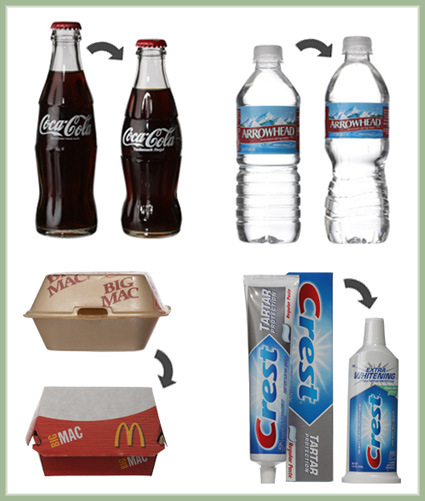
And often, they do not have to translate to sacrifices in product image or function. At times, they may even be enhancements, as some of these redesigned product packaging show (taken from NYTimes’ article):
greener-packaging

Clockwise from top-left:
1) Coca-Cola 8-ounce bottle: A smaller and lighter bottle (while retaining the same capacity), resulting in reduction in materials used: savings on the material as well as transport costs.
2) Arrowhead Mineral Water bottle: Nestle redesigned the bottle and cap to make it lighter and more recyclable, while narrowing the label by half an inch. This result in a 30% reduction in plastics used (while featuring the extra recess as handle), and less paper for the label.
3) Big Mac packaging: This is a familiar one – The Styrofoam clam-shell burger packaging was switched to the current paper-based ones, making them biodegradable.
4) Crest Toothpaste: P&G introduced a standalone rigid tube for Crest toothpaste, so that there wouldn’t be a need for individual paper-based boxes that most toothpastes now still come in.

As you can see, sometimes subtle decisions we make as we’re designing can indeed have a great impact down the line. While we may not be a green activist, being conscious of these responsibilities would certainly go a long way to alleviating the toll that our Earth is bearing.

Holy Grail of Retorts

While perhaps many would disagree with me, I’ve always held the viewp0int that non-malicious “insults”, especially those that are quick, witty and in response to its context is an artform in itself, and nothing really beats a frenzy volley of these statements, especially when sparred between close friends in an exercise to distill the holy grail of a put-down statement. And so with a mixture of glee and anxiety (that you may remember these better than I do the next time if we do meet), I present to you these nuggets of golden retorts I found:

1. I can’t believe that out of 10,000 sperm, you were the quickest.
2. I’ve had a perfectly wonderful evening. But this wasn’t it.
3. I don’t know what your problem is, but I’ll bet it’s hard to pronounce.
4. We’re all refreshed and challenged by your unique point of view.
5. I’ll try being nicer if you’ll try being smarter.
6. I’m already visualizing the duct tape over your mouth.
7. I will always cherish the initial misconceptions I had about you.
8. Well, you probably said it without thinking, the way you do most things.
9. I’m not offended by what you say. I’m just glad that you’re stringing words into sentences now.
10. I could have been your dad but the dog beat me over the fence.
11. I’m busy now. Can I ignore you some other time?
12. If ignorance is bliss, you must be the happiest person alive.
13. What’s your problem, wake up on the wrong side of your mom this morning?
14. Save your breath, you’re going to need it to blow up your date.
15. A little knowledge is a dangerous thing, but I don’t suppose that’s a problem for you.


Are you charging enough (freelancing)?

Well this is just too funny to miss – for those of you who do a bit of freelance work, here’s a (hopefully whimsical rather than serious) check on whether you’ve been charging enough. Ten signs that you may not be charging enough:

1. Your client mistakes your daily rate for an hourly one.
2. You’ve won every job you’ve ever pitched for.
3. Even though you work 80 hour weeks your income level qualifies you for welfare payments.
4. New clients are always asking what “the catch” is.
5. Clients pay your invoices in cash from their wallet.
6. Other freelancers regularly send you hatemail.
7. Your old clients don’t even bother asking you how much something is going to cost.
8. You never run out of work, yet you are subsisting on baked beans and 2 minute noodles.
9. Your 12 year old brother earns more spending cash than you flipping burgers.
10.Companies have been calling from India wanting to outsource their work to you.

[found here]

Sleeping Machine (?)

A new discovery could make it possible to take a “power nap” at the flick of a switch. Scientists have found a way to turn on deep sleep at will using a machine that magnetically stimulates the brain. A device worn on the head could in squeeze the benefit of eight hours’ sleep into just two or three hours.

A news clipping has reported that scientists have developed a technique – Transcranial Magnetic Stimulation – to induce slow waves through the skull and into the brain, where it activates electrical impulses that are typical of deep sleep. Apparently this could be a form of treatment for insomnia in the future, and could potentially also be used to induce a “Power Nap” that has the benefits of eight hour’s sleep in just a few hours.

The title of that news article reads “Machine Means End to Sleepless Nights”. As far as I see, that may be true for the clinical insomniacs. But I could also see it being used by people who don’t seem to quite have enough hours in a day – lawyers, auditors, office workers (basically everyone) to squeeze in yet another few more hours of work and productivity in place of sleep. It’d really be a slippery slope – if you can have a gadget that eliminates the need for you to sleep, and frees up the sleep-time for you to do whatever you want – would you use it?

In that case, the title should probably be “Machine Means Beginning of Sleepless Nights”.


Toyota Volta

toyota-volta

Is that a Lamborghini? Not quite. No, it isn’t one of the copycat cars either. If you’re sharp enough, you’d notice the Toyota badge on the front hood. So why is Toyota, a company known for its reliable, family-oriented cars doing with a high-end performance ride like this?

Turns out this is a concept vehicle called Volta (from a few years ago, I may add). The name would give it away – it’s a high-performance hybrid car that claims a 0-60mph in 4 seconds, even while achieving an economic fuel consumption of 435 miles for a 13.7 gallon tank (that’s 700km with about 50liter for us metric folks). What’s also intriguing is the internal layout (too bad they don’t have a picture of it):

The Giugiaro-designed carbon-fiber body seats three people abreast and features “drive-by-wire” controls, allowing you to position the steering wheel and pedals in front of any one of them.

So you can be a tree-hugger even with sportiness running through your blood! When this thing makes it to production, at least.

P/S: Toyota has been named by Business Week as the 3rd most innovative company in the world – just after Apple and Google. “Toyota’s dominance in hybrids has led to gas-electric cars for its Lexus brand and could bring the first plug-in electric hybrid within the next four years. The carmaker’s famous continuous improvement process—its own unsexy but effective approach to innovation—is being copied worldwide.”