Self Portrait

Recently, there was an influx of Youtube videos in which someone took a picture of him/herself everyday over many years, like Noah (6 years) and Lee (3 years), and then putting them together in a single video to show the changes through the years. It’s a reflection process – seeing how you have changed over the years; it’s also a tremendous evidence of perseverance – to be disciplined enough to literally take thousands of photos of yourself.

Of course, in true Internet-phenomenon fashion, various video replies have also surfaced, ranging from the “comparison” to what must be a million other spoofs. I’m not sure whether you have had similar ideas in the past – I have. Though I’d never got started. Some other ideas also include clipping the newspaper front page of my birthday every year, just to see how the world has changed as I grew older. (No, I don’t even have a single one).

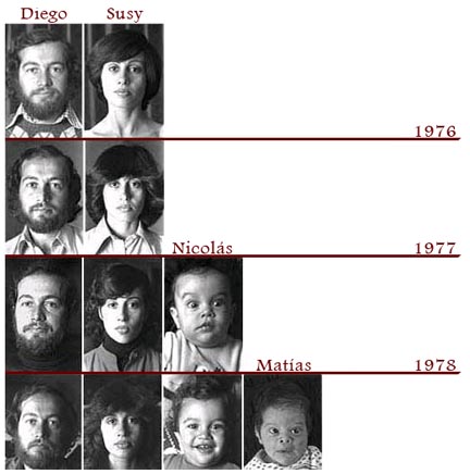
In a similar fashion, the Goldberg family also has their way of documenting the family. On June 17th every year, every member of the family would take a photo of themselves, documenting the addition of new members, growth of existing ones, and perhaps in the future, departure of some. While the Youtube videos trump in terms of number of photos taken, they definitely did not have the same history or legacy as the Goldbergs – they started way back in 1976.

It’s quite interesting to see how the picture chart grow: initially, there were only two – Diego and Susy. As the years pass, the couple become older, while their babies would eventually grow to be adults in year 2006.
family-picture

Full pictorial genealogy to today here.

Passionate Users

When it comes to how you’d measure how satisfied a user is with your product/service, an article summed it up quite succinctly and simply: the words that you need to look for coming out of the user’s mouth is: “COOL!”.

That’s where passion begins. Those are the words I want every user of my product to utter. Ideally followed up by something like:

“Dude, you have to check this out.”

I don’t want their reaction to be a measured, rational, dispassionate analysis of why the product is better than the alternatives, how the cost is more reasonable, feature set more complete, UI more AJAXified. I don’t want them to pause to analyze the boring feature comparison chart on the back of the box.

That is an incredibly high mark. Satisfying the user so completely that he is left with nothing but amazement, and it’s not stopping there: he is so satisfied from the product that there is nothing but a compelling, almost religious desire to spread it around – to his friends, families, and even strangers – just for them to experience the experience as well. This is the pinnacle of user satisfaction – have them like it so much that they just have to evangelize it.

These are the kinds of products that creates a fan base of its own – people would make video tributes to it; spoof it; make stuff about it that goes viral. And those are really the highest forms of honor and endorsement – possibly one of the most effective ones too, now that our attention span to individual advertisements across any platform are greatly reduced.

Some examples that I could think of are Apple products and Mozilla Firefox. While there may be other companies having items that can match the sale volume of Apple’s gadgets, how many can also boast websites created by fans in anticipation of future products? iPhone Concept Blog features fan art sent from around the world in anticipation of Apple’s iPhone. People dedicating many hours of their time, painstakingly dreaming up and illustrating what your company might produce in the future.

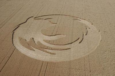
How about Firefox? It inspires users enough to have a site showcasing fans who spent time developing 30seconds flicks to advertise Firefox – free ads made and widely distributed by fans evangelizing the browser. Or how about this picture below – crop circles cut in the mark of Firefox – perhaps to advertise it to aliens from outer space?

cropcircle3

So, when you’re designing, set that ideal in mind – “satisfied” is a good start – but look beyond! Have them enthralled! Thrilled! Mesmerized! They’d tell the world about it, perhaps make guides and hacks around it; they’d be your most persuasive marketers. Have them evangelize your products!

Quotes from the Advertising World

You know how it is: clients give you business, and so they’re always right. Even when they aren’t. And sometimes, they just give such unexpected but firm demands that you don’t know whether to laugh or to cry. AdVerbatims has an excellent collection of amusing exchanges and idiosyncrasies exchanged between clients, art directors, copywriters, account executive etc. in the colorful world of the advertising business. It seems like all these exchanges could only happen in the advertising world too.

Here are 10 of my favorites:

#200- “Can you make the design 17% better?”
(Client, giving feedback to Account Executive)

#191- “Can we make the whites whiter?” – “Not really, its NTSC white is 255 255 255.” – “Yes, but can we make the Whites Whiter?”
(Client)

#179- “We need to send the client a .jpg of the image as soon as possible.” – “Sure. Do you think the .jpg will fit in this size envelope?”
(Agency, Intern to another intern, who was holding up an actual 6×9 envelope)

#171- “I went into photoshop, I just bought a copy, and I increased the image size to say 300 dpi, what do you mean it’s not high res?”
(Client, after beeing asked for 5th time for a high res version of the image)

#162- “What we give you is what you get.”
(Agency, Manager of graphic department, to a client)

#156- “This sky is too much of a dusk and too little of a dawn. Are we sure this is the dawn we saw yesterday?”
(Client, Brand Manager who was present on a shooting at 4 o clock in the morning)

#152- “If you can’t tell me exactly what you want the poster to look like, how am I supposed to design it?”
(Design House)

#118- “It’s amazing how well you interpreted the brief. This piece is exactly what we wanted, you could not have made it any better, I love it. But I also think it’s too good. This is for a bigger client, a more international one. We’re not like that. See if you can do something shittier that we can use.”
(Client, same Marketing Manager)

#116- “Can’t you make that dog smile? Don’t you have a smile filter on this expensive machine?”
(Agency, Owner)

#113- “We need your help. According to what I understood from the client, we have to put subtitles on the radio spots. Is that doable?”
(Agency, Account Assistant)

Minority Report Style Touch Screen


This is the real life version of Minority Report style user interface – a multi-touch sensor screen. Usually touch screens are only able to work with one point of contact at a time, but this can work with multiple points simultaneously – and thus instead of having to direct all our motion into one point (like controlling a mouse pointer), we can use all our fingers at one go.

This might not seem like much – you might think “oh yeah, so now you’ve got 10 mouse pointers!” – but freeing up the hands from a interfacing tool (like a mouse pointer, a stylus etc) gives a whole lot more intuitive and intimate interaction with the software – like how the Wiimote would open a whole new dimension of playing games.

Most of the video to me is just snazzy effect, but at around 2:40, Jeff Han demonstrated the light table application, which I think is fantastic. When you have a lot of things, you need to sort out the mess, and quickly switch between stuff – that’s where this product really shines.

Plus, now that we’re already so sedentary, it does no harm to have an interface that may help us shave an ounce off our flabby arms!

White Blood

white-blood

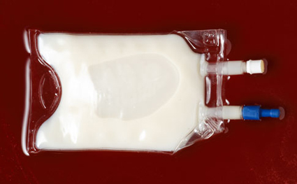
It’s white, it looks like milk, but it works like blood. Made from substances similar to the Teflon coating in your frying pan, this white liquid known as Oxycyte can carry up to 50 times the amount of Oxygen as normal blood, making it a great candidate for treating traumatic injuries. Its particles are also a whole lot smaller than the red blood cell, allowing it to squeeze through narrow constricted capillaries to reach the injured tissues.

Don’t expect it to replace our natural blood though – while it has vastly superior oxygen carrying capacity, it is lacking in other properties of blood – carrying hormones, fight infection, regulating pressure etc.

Interesting stuff from PopSci.

Episode #214 – Coke and Mentos Strikes Again!


By now it’s common knowledge that mixing Coke and Mentos gives a geyser fountain. The pioneers of the Coke-Mentos Geyser were from Eepybird, who has since tested the theory with 15 kinds of soda and all sorts of candies. This time they’re back with a bigger and badder vengeance – enter the Domino Fountain!

Watch as one fountain triggers the next – with some impressive effect too! Coke and Mentos has also seized this publicity opportunity by sponsoring the ingredients, so you’d get a longer, grander sugar load.

[Eepybird]

Banana Guard

banana-guard

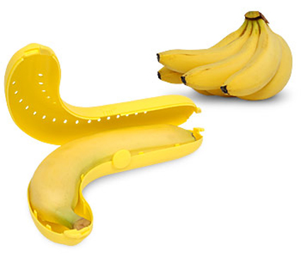
Are you fed up with bringing bananas to work or school only to find them bruised and squashed? Our unique, patented device allows for the safe transport and storage of individual bananas letting you enjoy perfect bananas anytime, anywhere.

The Banana Guard was specially designed to fit the vast majority of bananas. Its other features include multiple small perforations to facilitate ventilation thereby preventing premature ripening and a sturdy locking mechanism to keep the Banana Guard closed. The Banana Guard is of course dishwasher safe for easy cleaning.

Wow, what don’t we have? I’d be waiting for them to come out with BananaGuard 3.0 – one that allows you to throw a banana at a monkey, only to have it boomerang back to you, while you smirk and sneer away at the poor primate.

The Banana Saver, is available at Amazon