75th birthday for Phillips (the screw)

philips-patent-screw-driver

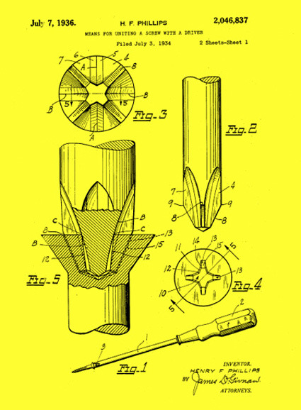
On July 7th 1936 (almost 75 years ago) Mr. Henry F Phillips received a patent for a type of screw and the accompanying screwdriver – the Phillips screw. The Phillips screw has been around for so long, and have been taken for granted for so long that I’ve never pondered about its birth – why did someone come up with a “+” shaped head to go along with the “-” shape. The only thing that went off in my mind was probably, “+” shape has four arms and somehow that makes it easier to turn and less likely to slip.

It was of course that, and more:

The Phillips-head screw and Phillips screwdriver were designed for power tools, especially power tools on assembly lines. The shallow, cruciform slot in the screw allows the tapering cruciform shape of the screwdriver to seat itself automatically when contact and rotation are achieved. That saves a second or two, and if you’ve got hundreds of screws in thousands of units (say, cars), you’re talking big time here.

And not only does a power Phillips driver get engaged fast, it stays engaged and doesn’t tend to slide out of the screw from centrifugal force. Another advantage: It’s hard to overscrew with a power tool. The screwdriver will likely just pop out when the screw is completely fastened.

Ah! That additional bit of engineering, design and thoughtfulness that almost everyone have taken for granted – and I suppose, that’s why it became such a popular fastener.

That said, consumer electronics do seem to increasingly treat screws with disdain – it is now seen more as a blot in the aesthetics, if you will. Could the screw ever one day disappear from manufactured products altogether?

[via WIRED]

Zoomii – Bringing Real Life to Amazon – Fail

zoomii

Zoomii was a website that took the books on Amazon and turned them into a more real-life like display with shelf presence. The covers of each book was arranged in neat ‘shelves’ where you could pan to browse around just (almost) like when you’re in a real bookstore. This perhaps makes online book browsing somewhat more intuitive and leisurely, unlike in typical sites where book-browsing or searching is more like a task to complete rather than part of the joy.

One major flaw for me though, is when you attempted to search for particular genre or books (e.g. ‘Design’), Zoomii brought you a search list instead of zipping you (I’d imagine myself flying) across the shelves to the relevant section (and maybe with a librarian-sounding voice going “Here’re the books you’re looking for” – alright, maybe not the voice).

After all that hard work convincing the user they’re in a bookstore, with one user-search you were dragged right out of that illusion and back to the 2-D world – this did not make much sense to me.  I suppose that is why the web site is now history.

Discussion: Design Competitions worth it?

revolution-copy

Regular reader Scott asks:

We designers and innovators struggle all the time to get our name “out there” so we can more quickly push our designs into reality.  Entering (and winning) such contests as Muji can certainly help, but at what cost?

If you sit back and look at the bigger picture of what is happening, it is really quite sad.  Let’s say a huge company needs to develop a new fun dispenser for their soap product.  They can spend millions hiring a prestigious design firm to get a filtered short list of a few new ideas put together by a team of perhaps 5 designers, or they can sponsor a design competition – disguise their motive in the form of a “challenge” to the designers of the world.

As in most design competitions, it would not be surprising to see 5000 designers enter from around the world.  Each designer would carefully follow the rules, in many cases pay a FEE of up to perhaps $100 or so and then spend hours carefully and vividly illustrating their novel work, presenting it in the exact form required by the rules of the competition (and the sponsoring company).  They would then submit their invention, their design, their intellectual property to so-called “judges” who work with the sponsor to determine select winners.  During this process, the sponsoring company has the privilege of inspecting the outcome of perhaps the biggest brainstorm session in the world.

The cost to the company is minimal (pay the judges and award $10,000/ $5,000/$1,000 to the winners).  For this small cost, the company gets to see incredibly diverse and innovative concepts from great minds of many parts of the world (ideas that have not be shown before) AND they get the rights to the designs they want AND they don’t have to pay royalties or give the struggling designer any design credit to HIS or HER design, AND they also get free advertisement as a result of being the sponsoring company (it looks like great PR – a win win win for the company).

Are we fools here?  I’m surprised all companies don’t tap into this wealth of eager brains.  We need to form a union to protect our innovations from the corporate world.

If we don’t win, which is often the case, we don’t even get any constructive criticism from the judges for our fee.  So we don’t really learn from the experience (design wise) and honestly, we can’t be certain that the judges even looked at our designs.  We often don’t even get a courtesy email to let us know that we didn’t make the next round.  I wish there was a better way.

What are your thoughts?

Perforated Container Architecture

angela_fritsch_architekten_pavillonimparkdesalicenhospitals-copy

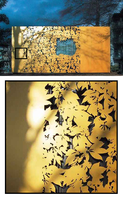
It’s rather incredible how the details in surface treatment makes all the difference in this prefab container:

In Darmstadt, Germany, The Alice-Hospital vom Roten Kreuz has commissioned Angela Fritsch Architekten to build a pavilion in the park in front of their main building, and the final result is a really creative design. The pavilion was constructed using a conventional system of prefabricated containers. In order to integrate it into the park, the surface finish of the facade is committed to adhering sheeting system patented by Hannes Freising from architectural facade firm Huellwerk. This ZGG pavilion (Zentrum Ganzheitlicher Gesundheit) was to consist of a cheap container box with a wallpaper made out of sheet metal. This golden cover has ornamental leaves cut out of it, making it a shiny and decorative structure in the hospital’s park.

I thought the solution was really elegant – transforming the drab container into 1) a pleasant thing to look at, just like a tree shedding its autumn leaves; 2) fitting into the context of the park; and 3) doing so at a (presumably) very low cost.

[via freshome]

Bomomo Painter

bomomo

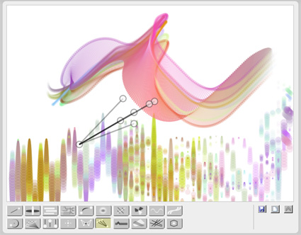
Bomomo is a rather interesting (if awkward) web painting tool – instead of controlling a still cursor as you would in Photoshop and such, the cursor for Bomomo are bouncing, twisting, or moving around. You get a whole series of cursors (seen at the bottom of the screen) with various behaviors; what happens next is probably a mixture of luck and design intuition.

Try it!

The Eco Zoo

the-eco-zoo

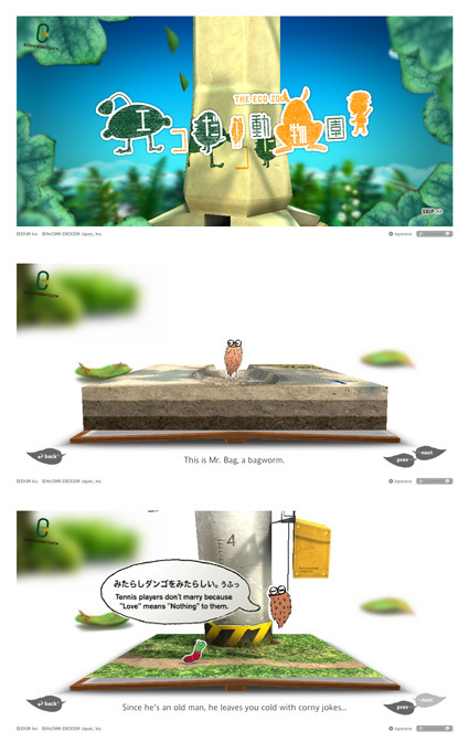
The Eco-Zoo is a rather interesting website with a very light-hearted touch to be more environmentally friendly. The topic isn’t what you’d term informative or authoritative, though what I really liked is the Flash execution: whimsical, detailed, delightful and unmistakably Japanese. See it for yourself!

Pulp Branding

logo-pulp-branding

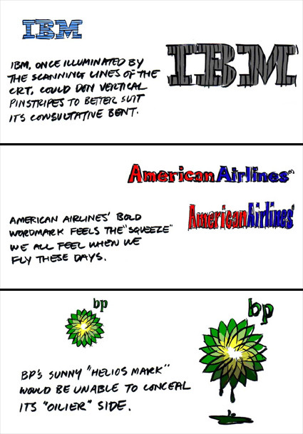
Pulp fiction is a niche comic targeted at marketing and perhaps more specifically, graphic branding people. Above are just some excerpts taken out of one of the issues “Logo Reflections” where the artist pondered what would it be like if logos were more a current reflection of the company rather than the (future) projections. Each issue is about 20+ ‘slides’, and there are already ten issues!

So, if you’re into logos and branding, head over!

Toy-a-Day

toy-a-day-blog

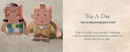
Joe, a talented (graphic artist perhaps?) guy started a a year-long project over at Toy-A-Day recently, where he’d design, construct and post a new paper toy from a basic template each day for one year.

toys-a-day

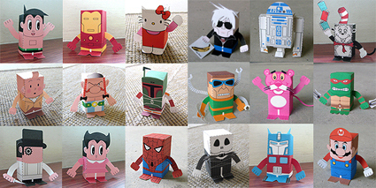
Here are the collections from Day 1 to Day 18 – pretty cool huh? What’s more, some of them are available as down loadable PDFs for your own amusement and handicraft session. With their flat bottoms, they’re perfect for perching on top of your monitor to lift a spirit or two!

Read At Work

readatwork

Now what did those pictures look like? A really boring and not-to-mention uglily laid-out PowerPoint deck in Windows XP? Perhaps it even resembles what your work computer screen looks like? Perfect! That’s actually a screenshot from Read At Work, a website dedicated to making your sneaky non-work reading as ‘official’ as possible. The web site now appears to belong to a gambling web site.

When you enter the site, it goes into a fake full-screen Windows mode, with several folders of ‘books’ for you to choose. The texts from these e-books are then churned into pseudo-PowerPoint slides, so you could while away your time reading your classic while appearing to be digesting a colleague’s PowerPoint presentation.

The lengths we go…

Don’t Look at the Gorilla!

gorilla-glasses

There’s probably very few designers who can boast of a design brief as unique as this:

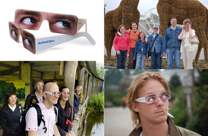
On 18 May a gorilla named Bokito escaped from Rotterdam Zoo. During his escape the animal attacked a female visitor, who had frequent eye contact with the animal. This presumably led to the attack, since gorillas do not like direct eye contact. Health insurance company FBTO always offers simple solutions, so the weekend after the escape we distributed more than 2.000 so-called BokitoViewers at the entrance to Rotterdam Zoo.

Now the gorillas will probably be wondering why’s everyone looking in that direction…