Digital Price Tags

tokyo-digital-price-tags

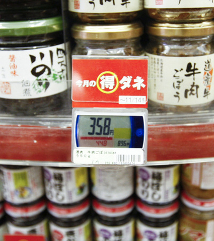
Jan Chipchase spotted over at his blog the usage of digital pricing tags in a supermarket in Tokyo. As he noted, there are many possibilities enabled by this new pricing information:

Why? The ability to dynamically change prices based on contexts such as time of day, customers in proximity, levels of stock, or the weather that you experienced five minutes ago creates so many opportunities. Small sign. Big implications.

Of course there’s also additional other conveniences like electronically updating your price, which means your staff won’t have to manually switch tags; or maybe prices of all chains of megamarts are fed back to a central server in real time, to make sure the there are no errant pricing in franchisees; or perhaps they mega ‘cheapest here or else’ marts can upload prices in real time to a social website for comparison.

But, if you have the power to dynamically change price, would you? Would the feeling of certainty and constancy be more important than the perceptively fluctuating or shifting price, which tends to lead to insecurities? Would the customers think they’re getting gouged when they have to pay a higher price responding to a certain context (even though they could’ve chose to think the other way – they got the discounts on other days)?

Food for thought…

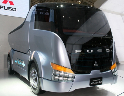
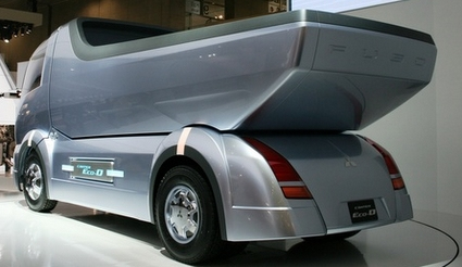
Fuso Eco-D Dump Truck

fuso-eco-d-1

fuso-eco-d-2

Concept car shows are often reserved for stylish sports cars or next-generation hybrids, but Mitsubishi Fuso is showing all the love to a vehicle we commonly prefer not to see – the dump truck. Sleek, futuristic and dare I even say – glossy silver – are hardly the keywords one would associate with dump trucks, but Fuso’s Eco-D concept may just change your perception of what it could be.

Alphabets of Design Classics

alphabet-of-design-classics

What better way to turn your tots into design addicts and connoisseurs than this Alphabet of Design Classics series by Blue Ant Studio. Or simply as a great decoration in the spirit of humor and fun. The likes of apples, bananas and cats fades out to give way to Aalto, Bertoia and Castiliogni – each with a nicely done silhouette of an iconic design piece. Personally for me I would have put the LCW molded plywood chair for Eames, and perhaps Panton for P. Perhaps you’d have a different take too.

After publishing it on their blog and receiving great feedback, these posters are now available as prints too!

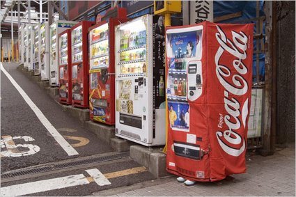
Vending Machine Dress (among others)

vending-machine-dress-01

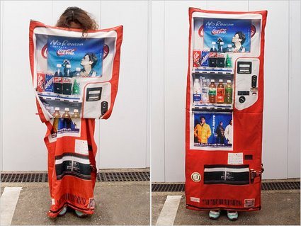
If you noticed something isn’t quite right about the vending machine above, don’t worry, you don’t need to check your eyesight. Yes, the right-most vending machine does look particularly fishy – wait a minute: is that a person wearing a vending machine suit? Has Halloween come to Japan in a weird manifestation?

In what appears to be stranger than fiction, New York Times carried an article with the title ‘Fearing Crime, Japanese wear the Hiding Place‘.

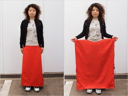
Deftly, Ms. Tsukioka, a 29-year-old experimental fashion designer, lifted a flap on her skirt to reveal a large sheet of cloth printed in bright red with a soft drink logo partly visible. By holding the sheet open and stepping to the side of the road, she showed how a woman walking alone could elude pursuers — by disguising herself as a vending machine.

I’m sure the headline was really just a sensationalist garb – it attempts to suggest that this is already a mainstream practice rather than simply a concept or a chindogu by a designer in Japan. Check how it transforms:

vending-machine-dress-02

vending-machine-dress-03

There are also other manifestations – a bag that transforms into a manhole cover so that people would walk past and not notice it; another bag for children that attempts to turn the child into an unsuspecting fire hydrant. These concepts are certainly amusing, but there is a greater cultural spirit and meaning behind:

But the devices’ creators also argue that Japan’s ideas about crime prevention are a product of deeper cultural differences. While Americans want to protect themselves from criminals, or even strike back, the creators say many Japanese favor camouflage and deception, reflecting a culture that abhors self-assertion, even in self-defense.

Perhaps it is this culture of invention-tolerance, no matter how idiosyncratic or bizarre, that facilitated Japan’s contribution to the world’s other (arguably more useful) innovations and inventions. It’s again of those moments – ‘it could only be Japan!’.

Very Clever Hearing-Aid Packaging

goodmorning-widex-hearingaid

This is simply brilliant. While the technique is not new – bands of print on a transparent sleeve can look animated when paired with appropriate underlying box graphic – the aptness absolutely shines through in this packaging design by Goodmorning (a design consultancy from Denmark) for Widex, known for their high definition hearing aid .

As the user pulls out the case for the hearing aid, the graphics dance and animate, mimicking the delightful motions of a sound wave. In fact, the graphics for this raster effect isn’t random either – it spells out Widex’s slogan “High Definition Hearing” (or how someone pronouncing it would look like anyway). Video here:


Nissan All-Round Camera Monitor


As the rear-sensors that beeps to alert drivers to obstacles become standard, Nissan has gone one-up to offer a full Around-View that gives drivers a bird’s eye view of their vehicle. Four cameras – mounted on the front, sides and the rear – captures images in real time and sends them to a central processor, which synthesizes the images and process them into easier-to-understand info-graphics.

Drivers who find parking difficult – rejoice!

Tre di Una – Hunn Wai

tre-di-una-hunn

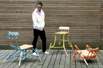
What if the most important structural parts of a chair are replaced by plastic clay? And how would the same chair look by simply altering the proportions of these connecting parts, while retaining the basic surfaces (hence the name Tre di Una, meaning “three from one”). This family of chairs are formed from a generic beech chair that is taken apart, and then pieced together again by colorful, plasticine-like clay connections, giving it a new and fresh character.

Hailing from Singapore, Hunn Wai studied in NUS before completing a Masters in Design Academy Eindhoven under the tutelage of Droog co-founder Gijs Bakker. You can find more of his craft-leaning designs over at his website.

Dandelion – Call for Entries at IDAsia

dandelion_logo

The Singapore Design Festival 2007 ran Nov-Dec 2007, and IDAsia.org had an online exhibition showcasing design talents from Asia. Titled as ‘Dandelion’, it is a virtual exhibition that has the blessing of DesignSingapore as one of the official events in this festival.

It is pretty much targeted to designers who are interested to sell themselves or their products that this exhibition will be their means to an end. Therefore the big requirement is that product images must consist as either non-functioning and functioning prototypes or models. They can be anything, portfolio work, furniture, packaging or anything product related.

The internet is filled with beautifully rendered images that really are at the end of the day impossible to make or realise, often this becomes a circular discussion that goes back to the fact that the design is just not well resolved. Therefore we aim for this exhibition to only showcase fantastic designers that can not only dream but also make as well.

If you have it, go flaunt it! Much more details at IDAsia.

Cool Desktop Wallpaper

desktop-wallpaper

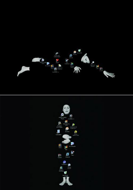
These desktop wallpapers aren’t quite like the typical pretty ones – more than being just a passive background, these are soulful wallpapers that demands your desktop icons’ cooperation to form themselves – at times seemingly thoughtful, at times contented, at times poetic. Just make sure your desktop ain’t too cluttered!